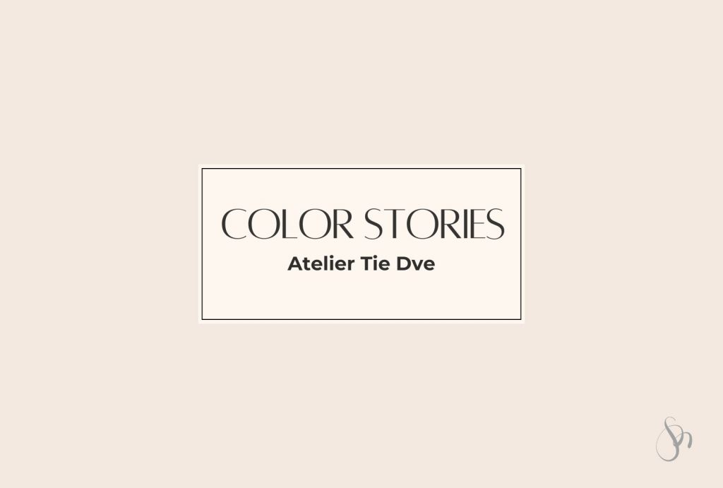
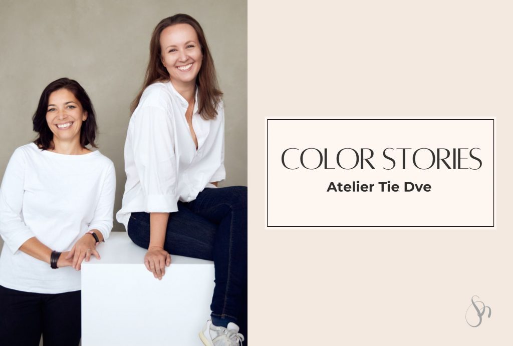
More then 20 years ago, we all met during our Master’s studies in Interior Architecture in Bratislava. Back then, we were just students dreaming up big projects (often in shades of grey, concrete, and glass). Fast forward to today, and two of my dear friends – Betka and Lubka – are running a successful design studio together: Atelier Tie Dve (which means “The Two” in Slovak).
Their work stands out for its courageous and beautiful use of color – something still quite rare in the world of architecture. I had the chance to chat with them about their journey, their creative process, and of course, their relationship with color.
On a personal note, I still smile thinking back to those early days – my first real interior job with Betka, our morning coffees (I still have the same cup!), and all the beautiful memories we share with Lubka and our whole interior architecture department. This interview is a little time travel and a big dose of inspiration all in one.
1. Betka, Lubka – can you introduce yourselves and tell us the story of Atelier Tie Dve? How did the idea come to life?
BH: Betka and Lubka. We’re classmates and friends from university (Faculty of Architecture at STU in Bratislava). We met in the final years of our studies when we both chose Interior and Exhibition Design as our specialization. Even then, it was clear what we were passionate about :). After graduating, we went our separate ways to gain experience in different studios and later also in independent practice. In 2017, Lubka called me and said, “Beti, how’s your schedule?”—and asked me to collaborate on the interior design of a family home. That’s where it really started. The name Atelier tie•dve came a bit later, quite spontaneously. Clients and business partners had already started referring to us as “those two,” so it stuck 🙂
LJ: Exactly! We were brought together by our architecture studies in interior design—not just the two of us, but also you, Mirka… and all the time we spent together, the conversations, the coffee, the projects—it all played a role.
2. What inspired you to work together as a duo – and when did you know you’d make a great team?
BH: For me, working as a duo or in a team is really beneficial. A lot of great ideas come from discussions. Of course, we don’t always agree, but that’s the point—we offer different perspectives to our clients.
LJ: I was inspired by the fact that I’m a team player. I never saw my future in solo work. In our context—especially for women—I find it extremely challenging to work independently without strong support from family and close ones. I did have a period where I worked alone and learned a lot, mostly about myself. It was a real life school, and I recommend it to the brave 🙂 But I missed sharing, bouncing around ideas, splitting responsibilities, experiences. Doing something together.
What I appreciate about working with Betka is that we’re very different—we have different backgrounds, abilities, and experiences. What I don’t enjoy, Betka does with ease. What she doesn’t know, I can handle. We complement each other. And yes, sometimes we get on each other’s nerves 🙂 But being a great team mostly comes down to our willingness to communicate behind the scenes.
3. How do you divide your roles today? Do you each have fixed responsibilities or preferences – or do you go with the flow and handle what’s on the list?
LJ: It wasn’t a conscious agreement at the beginning—we just observed each other’s strengths as we worked together. I’m more about dynamics and supervision, while Betka brings stability and depth. I handle client and supplier communication, monitor progress, manage deadlines, and ensure quality. Betka is great at the technical side—drawings, project documentation. She ensures the content is clear so contractors know exactly what to do. We always design together, and that’s the coffee-drinking phase 🙂
BH: Some parts of the process are divided, but it’s still evolving depending on the project and timing. After initial client meetings, we go through everything together and decide how to proceed. So it’s a mix of preset roles and flexibility, depending on the situation and also on the client’s attitude.
4. Betka, do you remember our first job together at the interior studio? I still think of those morning coffees and the excitement of working on real projects for the first time. What memories come up for you when you think back to those early days?
BH: Yes! I always looked forward to our morning coffee on the way to work :)) That’s when I realized how much more fun it is to work with someone than alone. I remember how we used to help and advise each other, and when we didn’t feel like working, we’d make coffee and joke around—and suddenly the mood was much better.
5. When we studied architecture, we only had one semester dedicated to color – and let’s be honest, we wern’t really encouraged to use it. How did your relationship with color evolve since then?
LJ: I agree, but I have fond memories of that semester. A lot has changed since then, both for me and in society. When I started in my first studio after school, gray tones and dark exotic woods were everywhere, with high-gloss finishes and brushed stainless steel accents. It wasn’t really my cup of tea, but it taught me to look deeper, beyond surface colors. Later came the minimalist era of white paired with local woods—oak, ash, stained beech—which I actually liked. It felt clean, new, and familiar. Today, the possibilities in materials, colors, and textures are endless. And clients are increasingly open, less afraid of color, which makes designing a joy. I’d call it a process of softening and heightened sensitivity.
BH: Yes, that color semester gave me a good foundation for combining colors and creating appealing contrasts. I’ve always loved color—whether in clothes, earrings, or interiors—and the bolder, the better! But always balanced with something neutral to calm the space. Later, I grew fond of pastels and even beige, which I used to find boring years ago.
6. Your projects today are full of color – was there a turning point or experience that changed how you felt about using color in interiors?
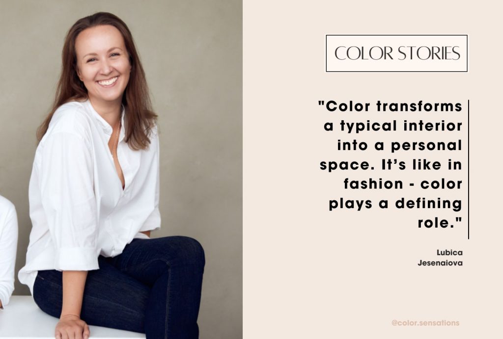
LJ: Definitely the courage of our clients to embrace color. We talk a lot about it with them and love supporting their decisions to add “their” color to the interior. I truly believe color is the element that transforms a generic space into something personal. It’s the same in fashion—color plays a big role.
BH: When Lubka and I visited the Salone del Mobile in Milan in 2022, I was thrilled to see how colorful everything was. It was a huge inspiration and confirmed my love for color in interiors.
7. How do clients react to color? Do they approach you because of your bold style, or do you have to gently nudge them toward being more adventurous?
BH: It varies. We’ve learned to ask a lot of questions early on to understand what resonates with them. Our clients might not seem bold at first, but they are usually open to new ideas, which we love.
LJ: Our society has developed a sort of uniformity, almost as a bad habit. We often hear: “What if I get tired of that color?”—so the “logical” conclusion is to avoid it. Or: “That’s not trendy now”—which really means: “What will the neighbors say?” There’s a lot of caution and a false sense of security. So our work with color often means taking careful, gradual steps. But I love how our clients are open to communication, and through that process, they discover their color, name it, bring it into their space, live with it, and enjoy it. It’s about having the courage to allow it—and so far, the feedback has been entirely positive.
8. Has the general attitude toward color changed in your experience over the years? Are clients braver now compared to when you started or is the love for neutral and “safe” still strong?
BH: Neutral solutions are still very popular, especially in spaces not designed for personal use—public areas or rental properties. But even in those cases, we often see an effort to stand out and be unique, which color can help achieve. In private interiors, clients are definitely bolder.
LJ: Building on what I said before, I definitely see a shift. We’re moving from cold, impersonal colors and materials toward warmer tones and more diverse textures. From “it looks good at first glance” to “I feel good here.” It’s a clear move in the right direction. Whether the color is a cool turquoise or a sunny yellow, what matters most to me is that I can support clients and help them overcome their initial hesitation.
9. What kind of projects do you mostly work on these days, and what kind do you enjoy the most?
LJ: These days we’re focusing more on healthcare facilities, which is an exciting challenge. We love that we can contribute to improving the environment where patients recover. We truly believe color plays a role in that.
I recently visited the exhibition Unsettled Soul by Japanese artist Chiharu Shiota in Prague. One of her thoughts stuck with me—she sees architecture as the third skin of a person. Clothing is the second, and architecture is the layer that connects a person to the world while also protecting them from it. That’s a beautiful way to describe the mission of our work. So if I get to do that—I’m living my dream.
BH: Right now, we’re mostly working on public spaces, but private interiors still make up a big part of our work. What we enjoy most doesn’t necessarily depend on the project type but more on the client—how we connect and the overall vibe during the design process. We love new challenges, but even designing a simple children’s room can spark our creativity.
10. Has your design process or aesthetic changed in the past few years, and if so, what inspired that change?
LJ: I believe it has, but maybe our clients could answer that better. Designing is a journey. I personally think that if I start answering client questions only with tried-and-tested solutions, something’s wrong—it’s time to reflect. Our work is about constantly discovering new possibilities. And yes, my personal aesthetic has changed—I’m more open to experimenting.
BH: Just like life, our profession is full of changes and inspirations that keep pushing us forward. I feel like we’re spending more time talking to clients during the design process, trying to understand what they truly need. People today are overwhelmed by the outside world and information, and that affects aesthetics too. Clients seek solutions that are simple, functional, and clean. In such spaces, their personal items—like books, art, or color—can really shine.
11. If budget and restrictions didn’t exist, what would your dream project look like—and what color would dominate the space?
LJ: I imagine a white building surrounded by greenery, with the sound of running water and birdsong. A center for self-care, quiet and deeply connected to nature. Dominant colors would be white, nude shades, and green. I also care deeply about textures—they give color another dimension and depth. The whole place would be filled with calm, kindness, and the permission to just be. In my imagination, it started as a wedding salon, then became a wellness center, but now I could see it as a senior care center.
Another vision is my dream family house—with a huge winter garden full of flowers and a beautiful view of the landscape. In my mind, I see feelings more than shapes or furniture. What’s certain is that it would feel safe and pleasant for everyone.
BH: I imagine a house on a high cliff—one side completely glazed and facing the wide open sea, the other connected to a dense forest by a small bridge. A wraparound terrace offers views in all directions. The “sea side” would be warm and peaceful; the “forest side” fresh and full of life and sounds. I haven’t visualized the interior as much, but for me the setting and atmosphere are key. I can imagine darker, matte, earthy tones that contrast with the sunlit exterior—colors like terracotta, clay, and wood. And of course, green from the plants.
12. What’s your personal favorite color and favorite color combination to use in interiors?
LJ: I love all colors, but if I had to choose—white, nude shades, and green. My all-time favorite is emerald green, which I brought into my home with a narrow jewelry cabinet. In interiors, I like combining a neutral base with colorful accents, which often come from the clients themselves.
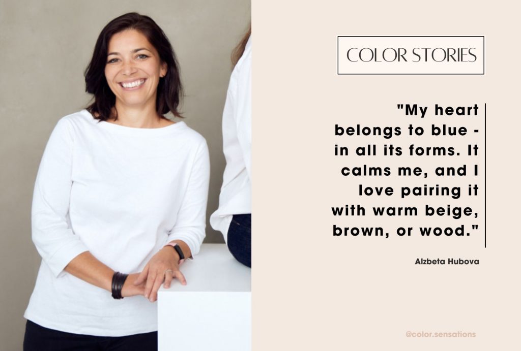
BH: My heart belongs to blue—in all its forms, from gray-blue to turquoise. It calms me. I like pairing it with warm beige and brown tones, and also with other colors and wood. At home, I’m especially bold with it. I also like soft pastels, but contrast is important to me—I love when one color pops as an accent.
13. And how about fashion – do you both wear color? What’s your favorite color to wear, and does it reflect your personality?
LJ: I admire colorful fashion on others. For me, it’s more practical—darker tones in winter, lots of white in summer. On gloomy days, I’ll consciously reach for my favorite yellow hoodie. I love basics I don’t have to overthink—I know they’ll always match. I don’t like meaningless slogans or big logos, but I love sarcasm and humor—that belongs on any piece of clothing 🙂 If I wear color, it’s usually as an accent—shoes, bags, jewelry, or makeup. The color that reflects me most is white—in all its tones. Cool and crisp in summer on cotton, muslin, or linen; softer in winter knits. RAL 9003 🙂
BH: I love dressing in color—it really depends on my mood. When I want to hide, I wear gray; when I want to stand out, I wear red. In the past, I was much more colorful—four colors at once wasn’t a problem 🙂 That’s changed a bit, and now I prefer combining one bold color with neutrals like white, gray, or black. I love cool tones—either completely solid pieces or geometric prints. Blue and petrol shades are my go-tos, and depending on my mood, sometimes red or yellow. Recently, I’ve fallen for a cool purplish-pink hue.
14. Finally, what advice would you give to young designers who love color but feel unsure or afraid to use it?
LJ: There was a famous Slovak ad for Kofola soda with the slogan, “If you love it, there’s nothing to think about”—and that would be my advice. If it feels right, then it is right. But don’t get too comfortable—keep refining your presentation, seek answers within yourself and around you. Remember that everyone sees colors differently. Choosing and designing with color is always a shared journey—with the client, their budget, your own ambitions and mood. But what should always come first is mutual respect and honoring agreements—that builds trust, and with that, you can create anything.
BH: Try things out, experiment! Pay attention and listen to what clients are really saying—even between the lines. Follow your instincts. Be inspired by nature. Color is a natural part of life—so why be afraid of it? 🙂
I truly enjoyed this conversation with Betka and Lubka – it brought me right back to our student days in Bratislava. Those years were full of life, dreams, creativity (and not enough color 😉), and looking back now, I sometimes miss the freedom and lightness of that time.
Talking to them reminded me of how much those early experiences shaped us. And honestly, I can’t help but think… if I had stayed in Bratislava, maybe it would be Studio The Three instead of Studio The Two!
If you enjoyed this interview, check out the other inspiring conversations in my Color Stories series, like the one with my teacher and color mentor Merel from the International Color Style Institute. Each story shines a light on the colorful paths people take and the role color plays in their personal and professional lives.