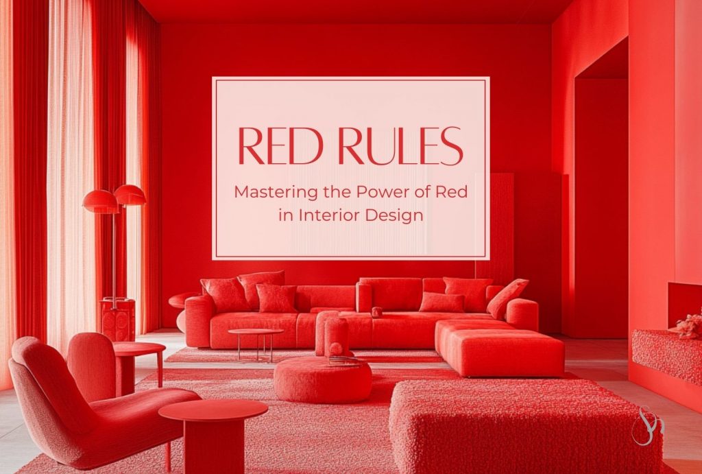
Red is a color that evokes strong emotions. It’s bold, dynamic, and attention-grabbing, making it a powerful tool in interior design. Here are some tips and considerations for incorporating red into your home interiors.
Understand the Psychology of Red
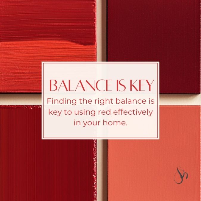
Before you start painting walls or purchasing furniture, it’s important to understand the psychological impact of red. This vibrant hue is associated with: energy, passion, and warmth. It can stimulate conversation, appetite, and even physical activity. However, red can also feel overwhelming if overused. Finding the right balance is key to using red effectively in your home.
Choose the Right Shade
Red comes in a wide spectrum of shades, each with its own unique personality:
- Vibrant and bright reds: like Crimson and Scarlet are ideal for creating bold, statement-making spaces.
- Deeper, muted reds: like Burgundy and Maroon bring sophistication and warmth, making them perfect for traditional or elegant settings.
- Earthy reds: like Rust and Brick offer a grounded, cozy vibe and work well in rustic or industrial interiors.
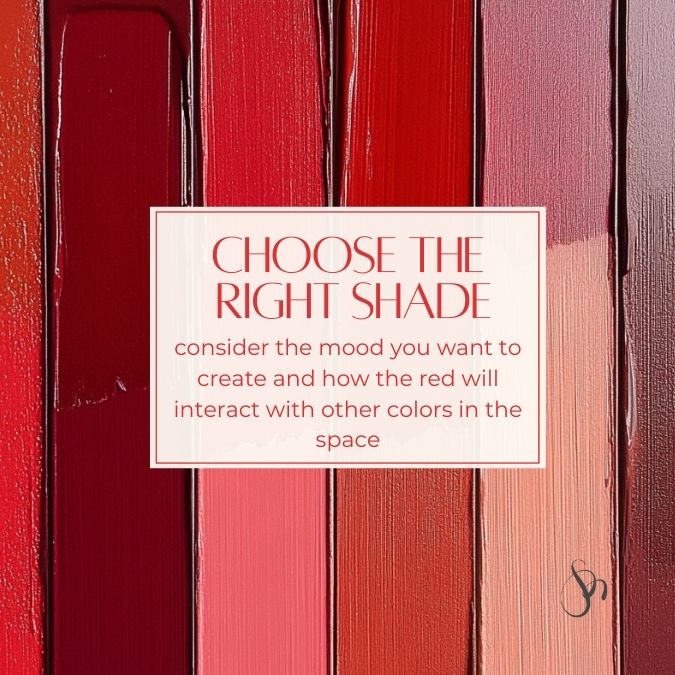
When choosing a shade, consider the mood you want to create and how the red will interact with other colors in the space.
Incorporating Red: Different Amounts and Applications
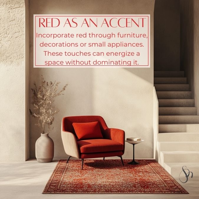
- As an Accent: Incorporate red through furniture or decorations like throw pillows, rugs, artwork, or small appliances. These touches can energize a space without dominating it.
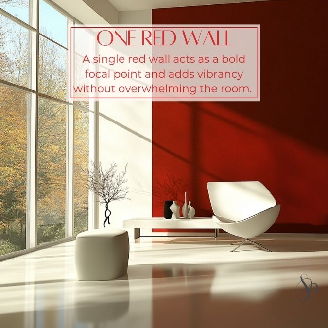
2. One Red Wall: A single red wall acts as a bold focal point and adds vibrancy without overwhelming the room. Pair it with neutral tones to balance its intensity.
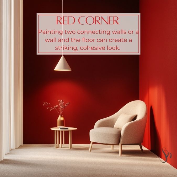
3. Two Walls (Corner or Wall + Floor): Painting two connecting walls or a wall and the floor can create a striking, cohesive look. This works well in modern or minimalist designs.
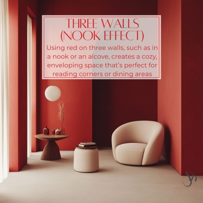
4. Three Walls (Nook Effect): Using red on three walls, such as in a nook or an alcove, creates a cozy, enveloping space that’s perfect for reading corners or dining areas.
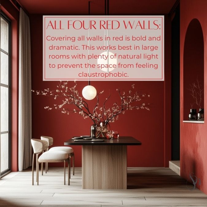
5. All Four Walls: Covering all walls in red is bold and dramatic. This works best in large rooms with plenty of natural light to prevent the space from feeling claustrophobic.
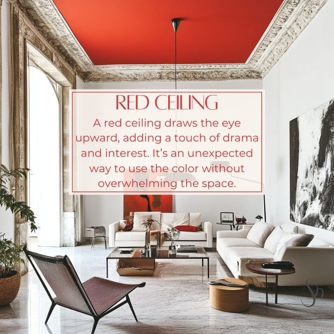
6. Only the Ceiling: A red ceiling draws the eye upward, adding a touch of drama and interest. It’s an unexpected way to use the color without overwhelming the space.
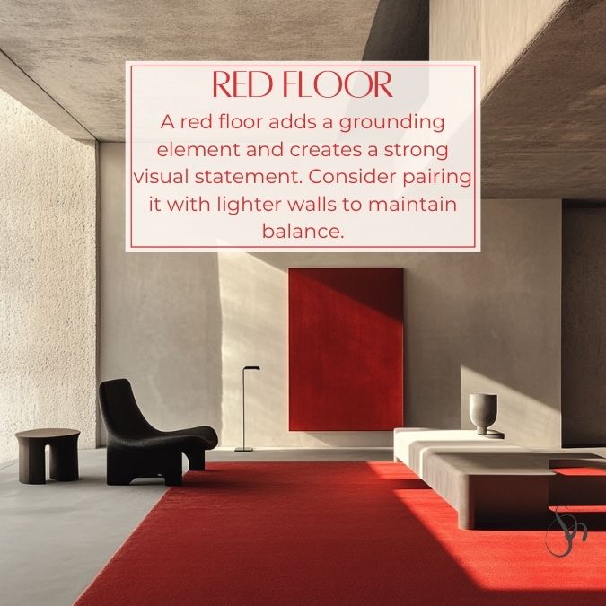
7. Only the Floor: A red floor adds a grounding element and creates a strong visual statement. Consider pairing it with lighter walls to maintain balance.
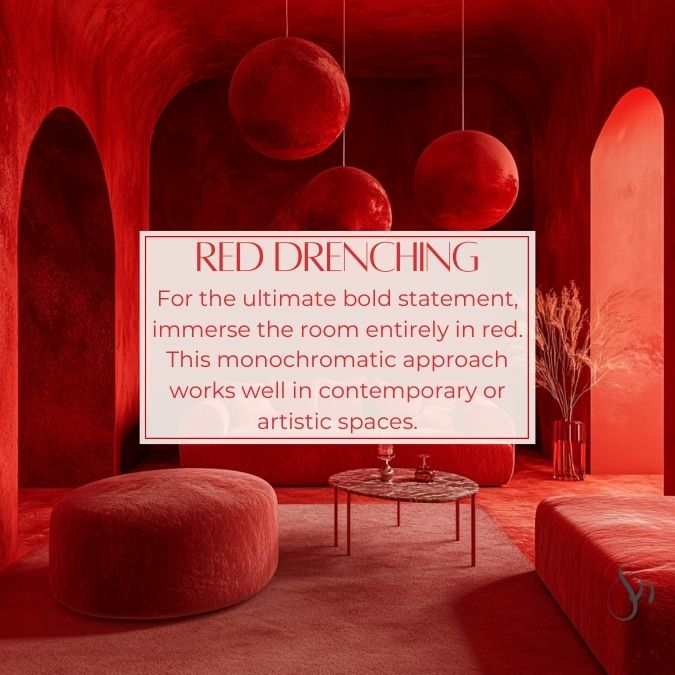
8. Color Drenching: For the ultimate bold statement, immerse the room entirely in red—walls, furniture, and even decor. This monochromatic approach works well in contemporary or artistic spaces.
Pairing Red with Other Colors
Red is a versatile color that pairs beautifully with a variety of hues.
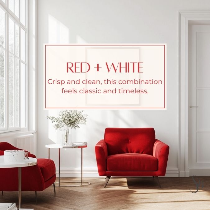
White + Red: Crisp and clean, this combination feels classic and timeless.
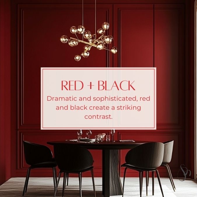
Black + Red: Dramatic and sophisticated, red and black create a striking contrast.
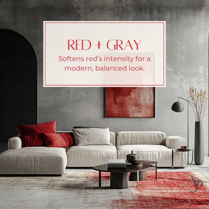
Gray + Red: Gray softens red’s intensity for a modern, balanced look.
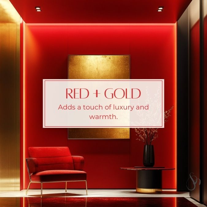
Gold + Red: Gold adds a touch of luxury and warmth.
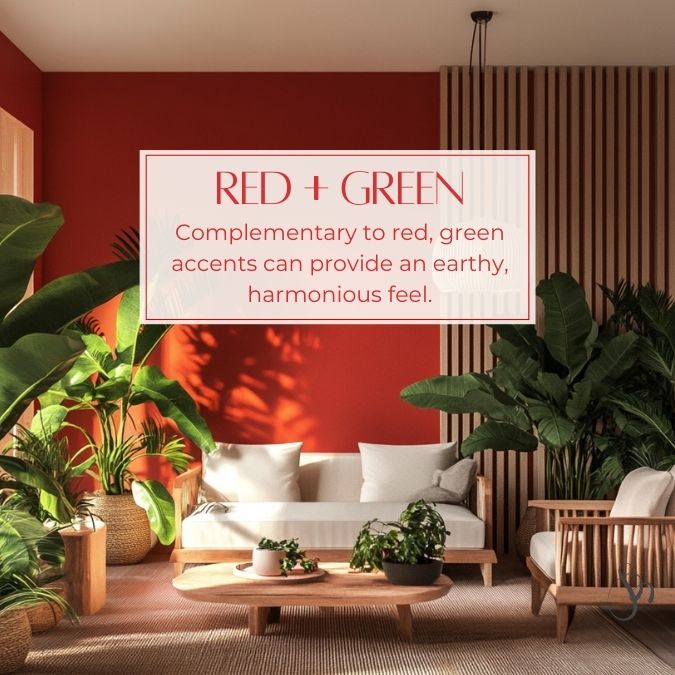
Green + Red: Complementary to red, green accents can provide an earthy, harmonious feel.
Red in Different Rooms
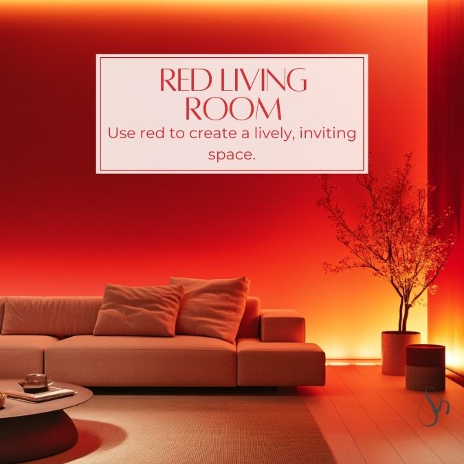
Living Room: Use red to create a lively, inviting space. Consider red curtains, a bold area rug, or an upholstered chair.
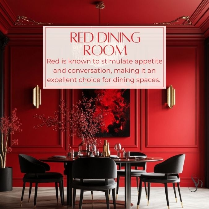
Dining Room: Red is known to stimulate appetite and conversation, making it an excellent choice for dining spaces. Paint the walls a deep red or add a red centerpiece.
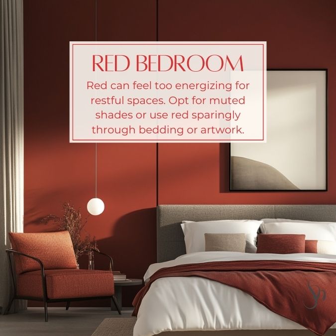
Bedroom: Red can feel too energizing for restful spaces. Opt for muted shades like burgundy or use red sparingly through bedding or artwork.
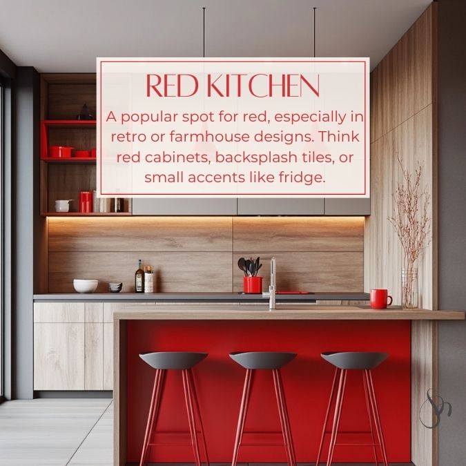
Kitchen: A popular spot for red, especially in retro or farmhouse designs. Think red cabinets, backsplash tiles, or small accents like fridge.
Consider the Lighting
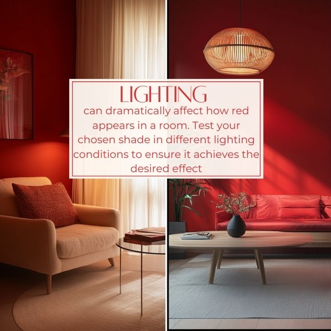
Lighting can dramatically affect how red appears in a room. Natural light tends to enhance red’s vibrancy, while artificial light can alter its tone. Test your chosen shade in different lighting conditions to ensure it achieves the desired effect.
Red in Restaurants and Public Spaces
Red isn’t just for homes; it’s also a popular choice for restaurants and public spaces due to its dynamic and stimulating nature:
- Restaurants: Red stimulates appetite and conversation, making it an excellent choice for dining spaces. Bright reds are often used in fast-food restaurants to create a sense of urgency, while deeper reds lend a sophisticated ambiance to fine dining establishments.
- Retail Spaces: Red can create a sense of urgency and excitement, encouraging customers to make purchases. It’s often used in sale displays or to highlight specific products.
- Offices: Used sparingly, red can inject energy and creativity into workspaces. It’s particularly effective in brainstorming rooms or areas designated for collaboration.
- Hospitality: In hotels and lounges, red adds warmth and luxury. Deep reds in upholstery or decor create an inviting and intimate atmosphere.
- Cultural or Artistic Spaces: Red can evoke emotion and draw attention to specific areas, making it a powerful tool in museums, theaters, or galleries.
Balance is Key
Red is a dominant color, so balance it with neutrals or softer tones to avoid overwhelming the space. Incorporating textures and patterns can also help diffuse red’s intensity.
Red is a daring and versatile color that can transform any interior space. Whether you’re looking to make a bold statement or add subtle warmth, this passionate hue has something to offer. By understanding the psychology of red, selecting the right shade, and balancing it with complementary colors and textures, you can create stunning interiors that reflect your personal style.